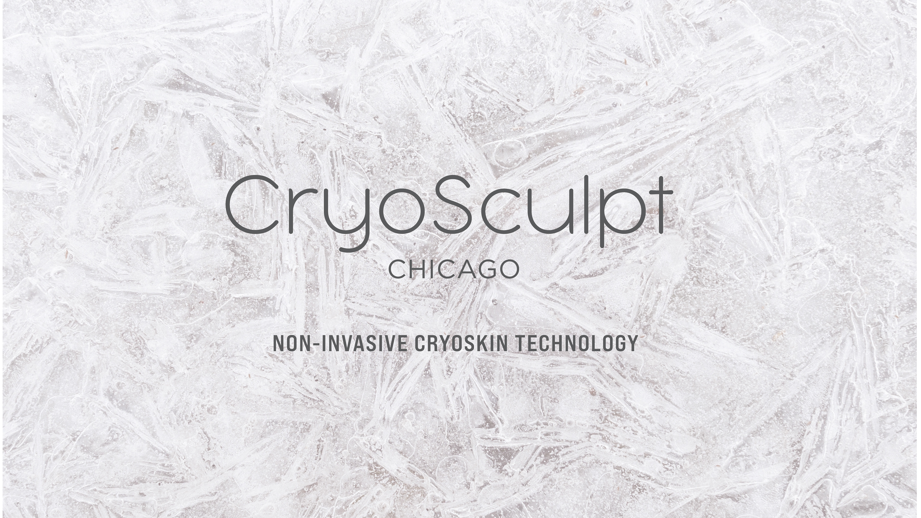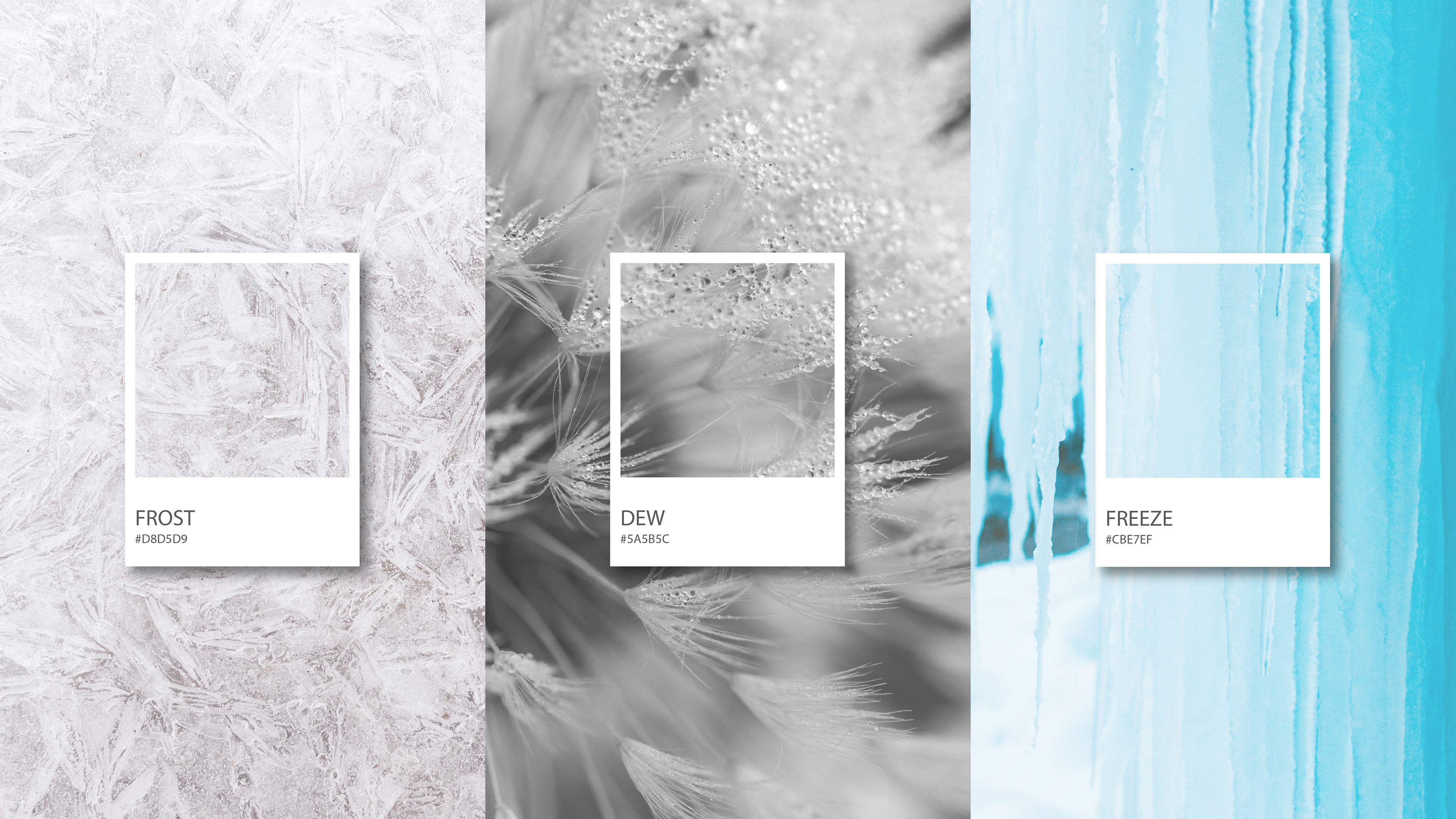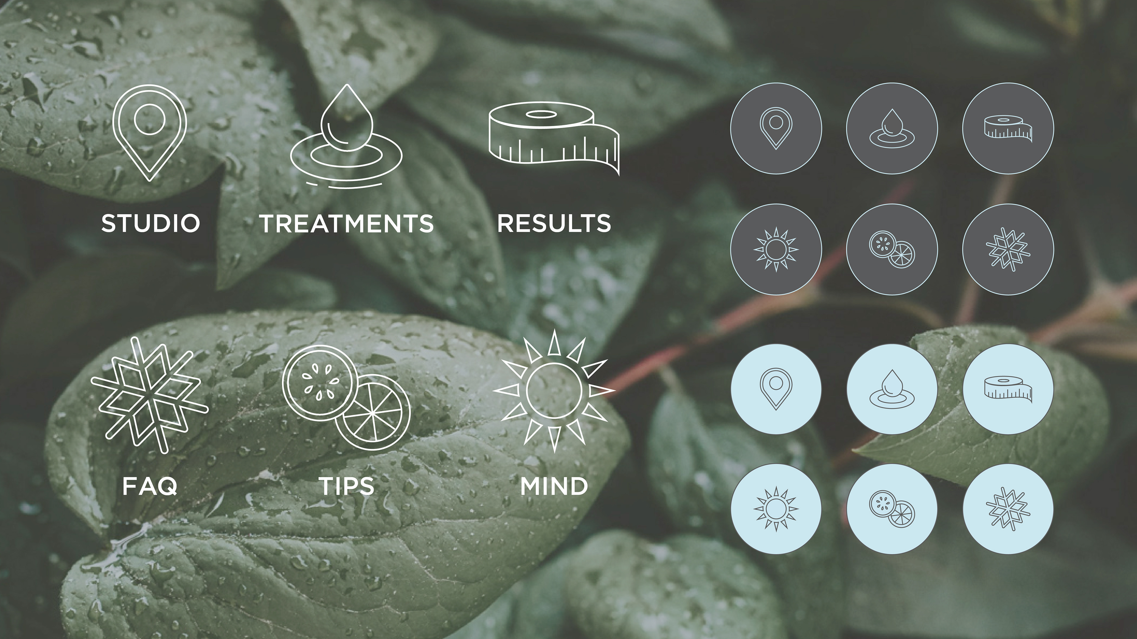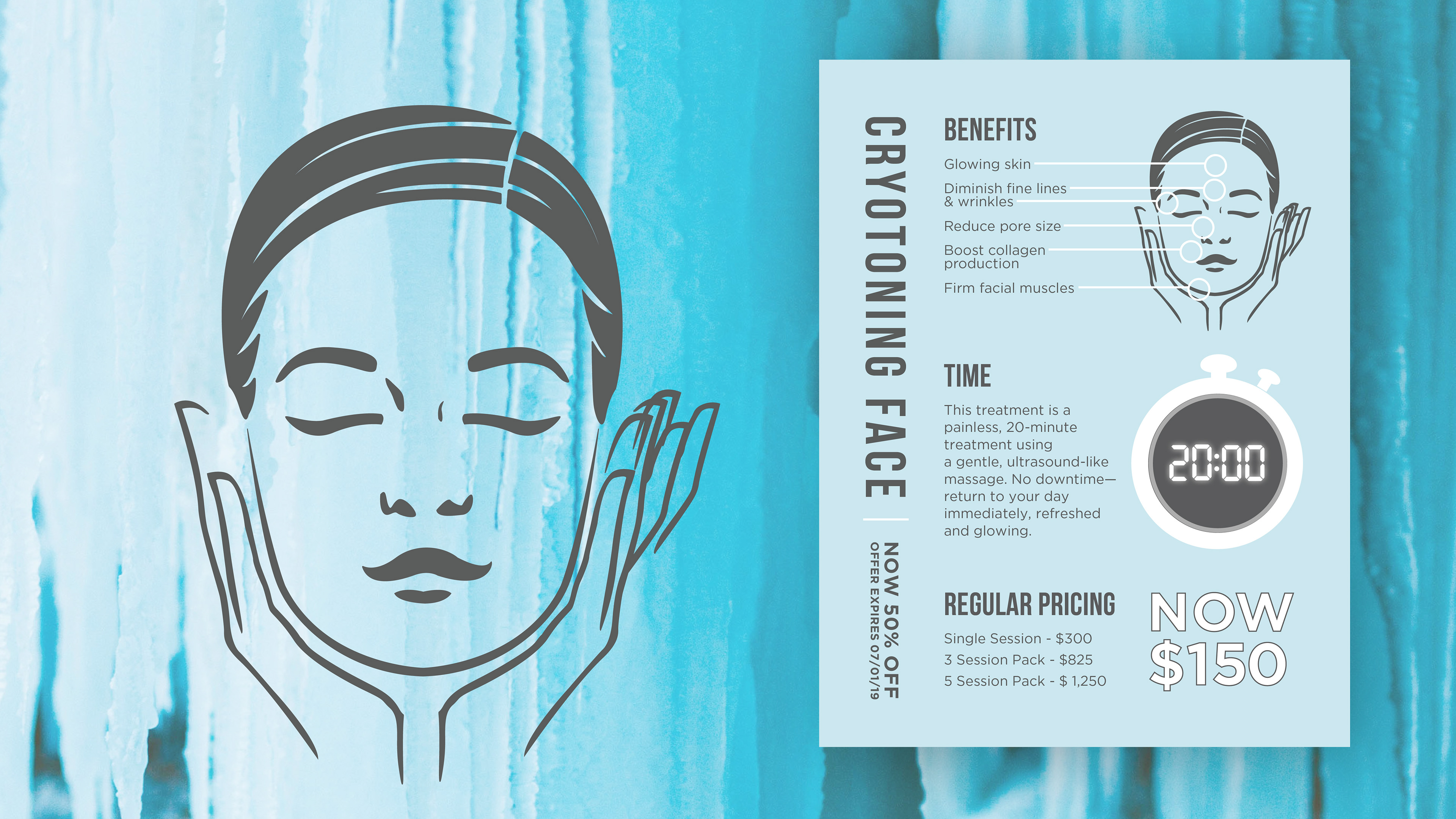
I worked closely with the owners of CryoSculpt to build a brand that felt holistic, calming, and inviting from the very beginning. Inspired by the Cryoskin 2.0’s hot and cold technology, we created a visual identity rooted in contrast and balance — blending cool, icy tones with soft, natural neutrals to reflect both the science behind the treatments and the tranquility of the studio environment.
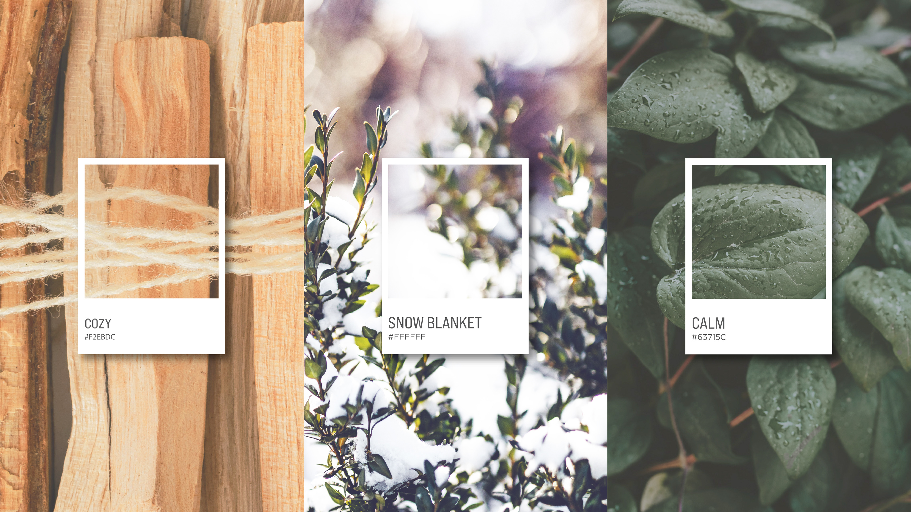
We drew inspiration from nature as a core theme, incorporating organic greens, airy blues, warm wood tones, and textured imagery to evoke a sense of renewal and serenity. The color palette was intentionally curated to feel grounded and restorative, helping the space feel less clinical and more like a sanctuary.
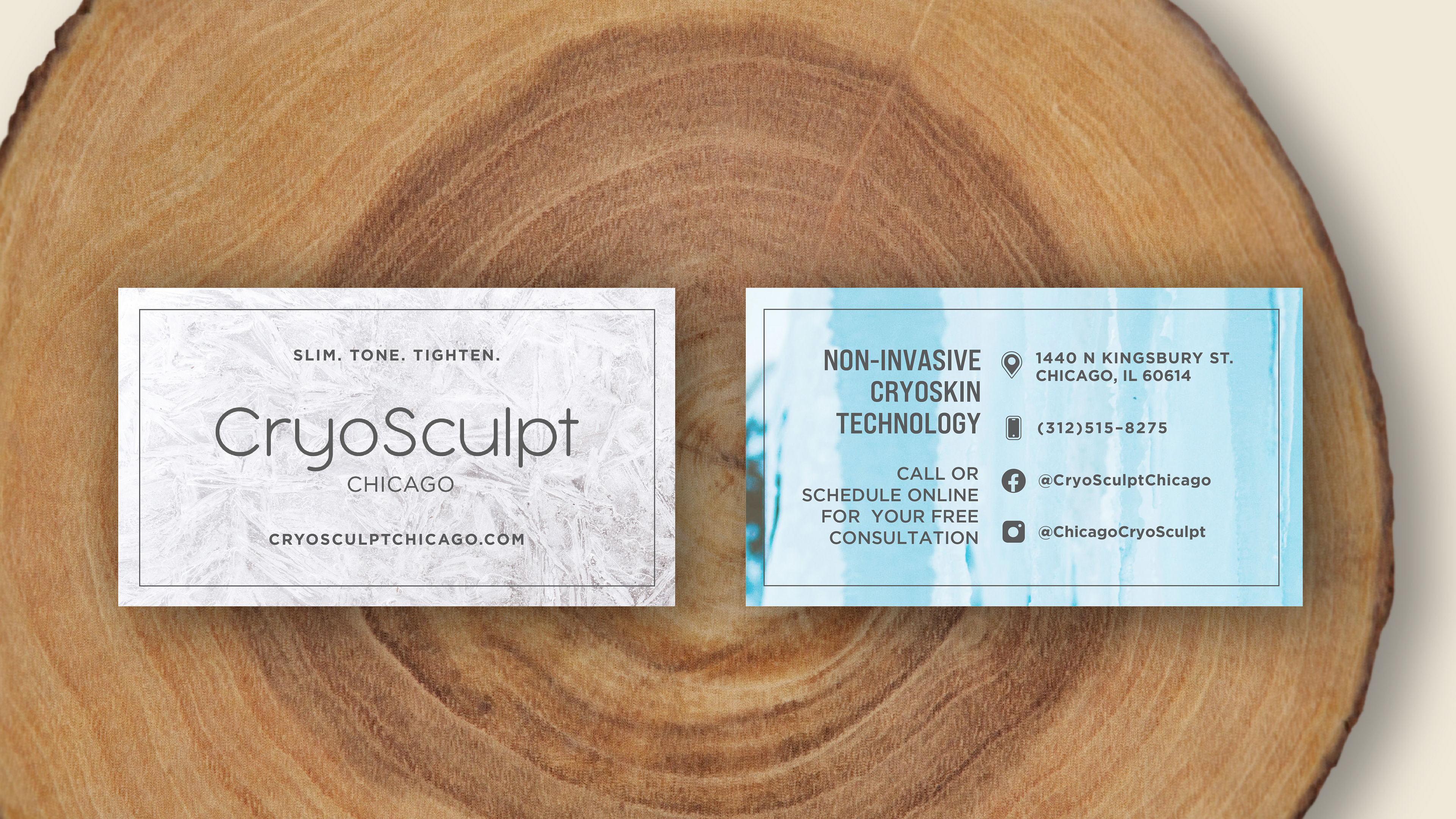
I also designed the logo using a clean, rounded sans-serif typeface to reinforce the brand’s smooth, minimal, and modern feel. The softness of the letterforms complements the idea of transformation without harshness — aligning with the gentle yet effective experience clients receive.
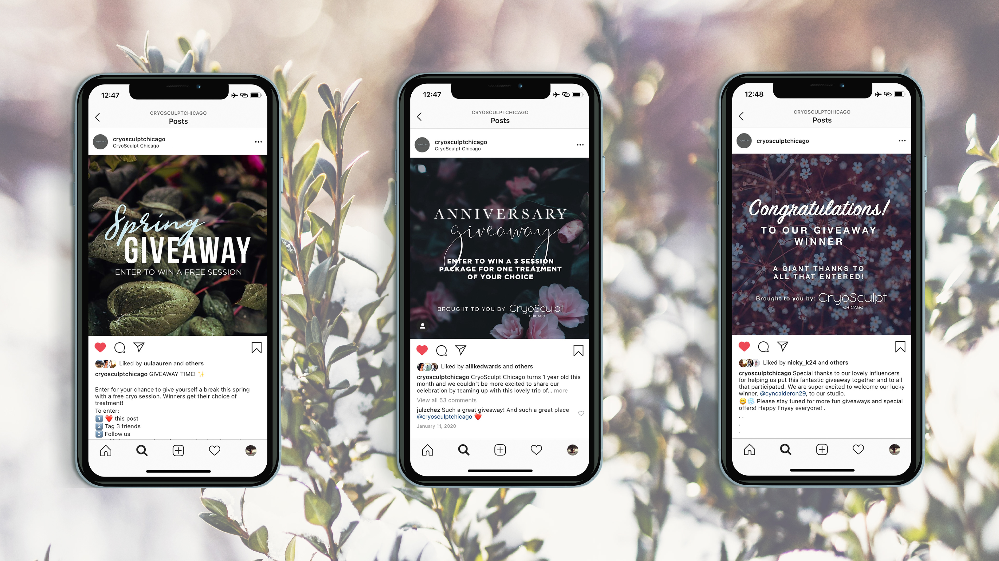
The result is a brand that feels balanced, welcoming, and elevated — one that mirrors both the technology behind the treatments and the calming, confidence-building atmosphere CryoSculpt set out to create.